Darryl Fears at the Washington Post writes about newly released data from the San Francisco Bay area that shows much worse air pollution in neighborhoods where people of color live. The data was collected by Aclima in partnership with the Bay Area Air Quality Management District, using mobile monitors instead of fixed monitors like EPA uses.
Fears reports that communities of color are exposed to 55% more nitrogen dioxide (NO2) than white communities. For example, in Alameda County (Oakland and nearby areas), 70% of black residents live in areas with NO2 above World Health Organization standards, while only 40% of white residents do.
Aclima got the same readings as the fixed monitors when their mobile monitors were near the fixed monitors. But when they went farther away from the fixed monitors and into communities, they found big discrepancies between neighborhoods, with more air pollution in neighborhoods where people of color live. This shows that while the fixed monitors work, they are not capturing the true amount of air pollution.
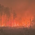
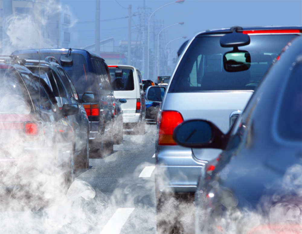
NO2 is a serious air pollutant, it causes asthma attacks in people with asthma, damages lung growth in children and teens, and is linked to increasing the risk of developing asthma in children. It affects adults who have heart disease, and is linked to increased risk of being infected with Covid and of having worse Covid once people are infected. NO2 is also a chemical that contributes to ozone formation on hot sunny days. NO2 comes primarily from traffic such as cars, trucks, and other vehicles. Trucks generally make more NO2 than cars.
Fears notes in his article that California rules prohibit trucks on Interstate 580 which goes near white neighborhoods, while it allows trucks on Interstate 880 which goes right through Oaklands black neighborhoods. This is an example of environmental racism, and how our country’s policies put more air pollution right into neighborhoods where people of color live. While this data is from California, it shows the need to do more and better monitoring in every city in the U.S. It also shows the need to really work on air pollution and inequitable exposure differences.
Please read the full article by Darryl Fears in the Washington Post, it is longer and more detailed.
You can see actual pollution data from the Aclima project by county here. You can look up data by county, or you can look up a specific address.
06/03/2022